Visual Identity for ‘not another supplement brand’: Based Origins
In a world where enough is never enough and the pursuit of more often leads to stress rather than serenity, we strive to return to simplicity. By drawing inspiration from our ancestors, we innovate through reflection. We declutter our lives and focus on what truly matters: being yourself, being at peace with yourself, and being one hundred percent you. That’s what we call ‘based’.
Based Origins. All you need is 100% you.

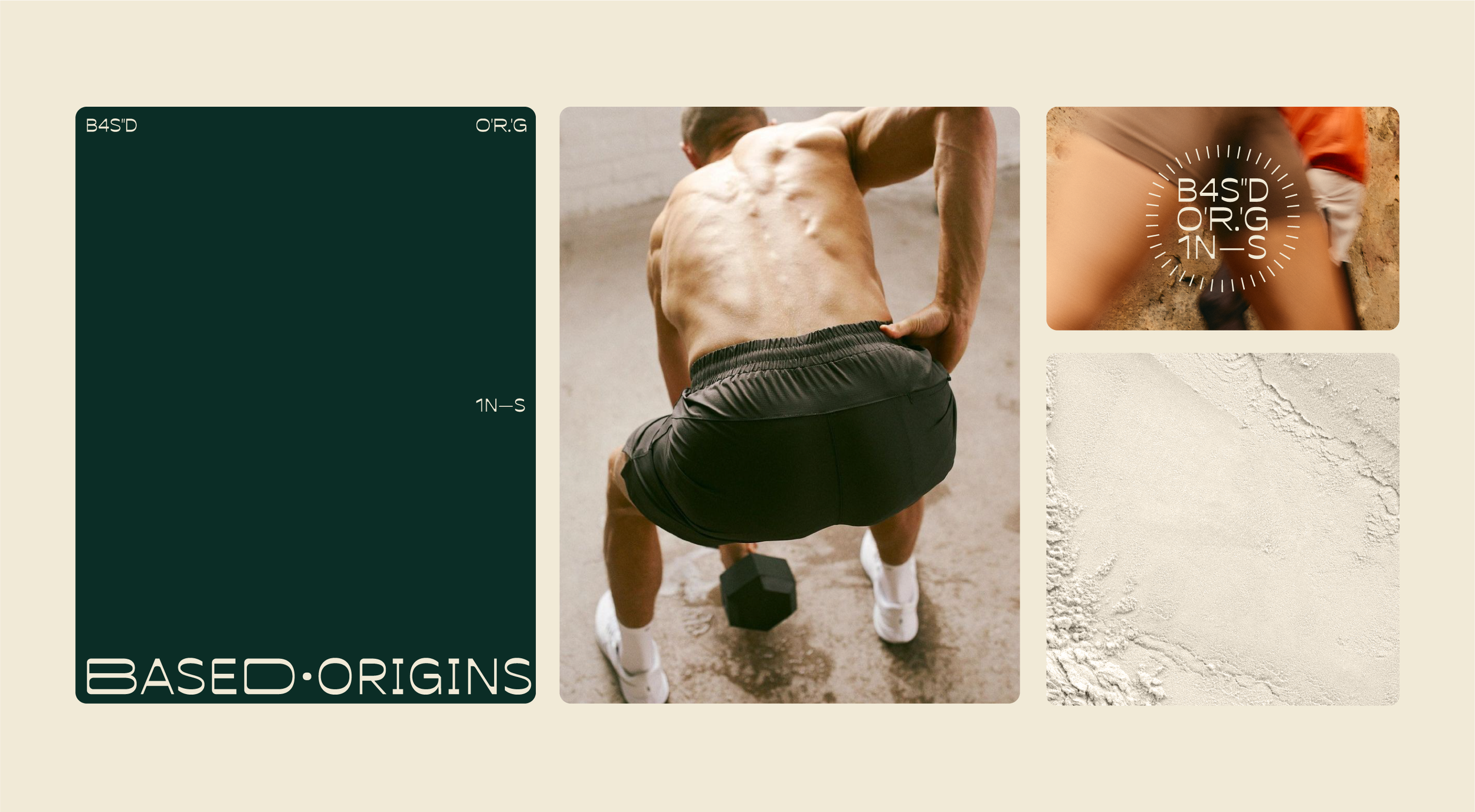
A versatile and guiding logo
Our logo is a creative translation of our brand name, presented as coordinates. It symbolizes a place—a mental space we call 'based,' where you are 100% yourself.
As our DBA, we use the mark to serve as a guiding beacon for self-discovery or a seal of approval for the exceptional quality of our pure ingredients.
The design evokes a sense of ancient mystery, paying homage to our ancestors who understood that a healthy lifestyle does not need to be complicated.

The color palette creates a warm and welcoming atmosphere for the overall look & feel.
With a clean and fresh off-white base, green tones that reflect the natural and healthy essence of our products, warm red hues representing our animal- based ingredients, and a bold orange that radiates vitality and life, helping us stand out from the crowd.